
THE DESIGN OF BELCHENGRUPPE
We love bold, high-contrast design and are fascinated by the nature of time. Our design brings these together in aesthetic solutions that feel familiar while challenging established ways of seeing. True to our principle: We deal with the imprecise nature of time with creative and technical precision.
The overall appearance of our watches is defined by countless details, all following the same principles: crisp edges, high contrasts, design consistency, precision and a humorous exploration of visual habits.
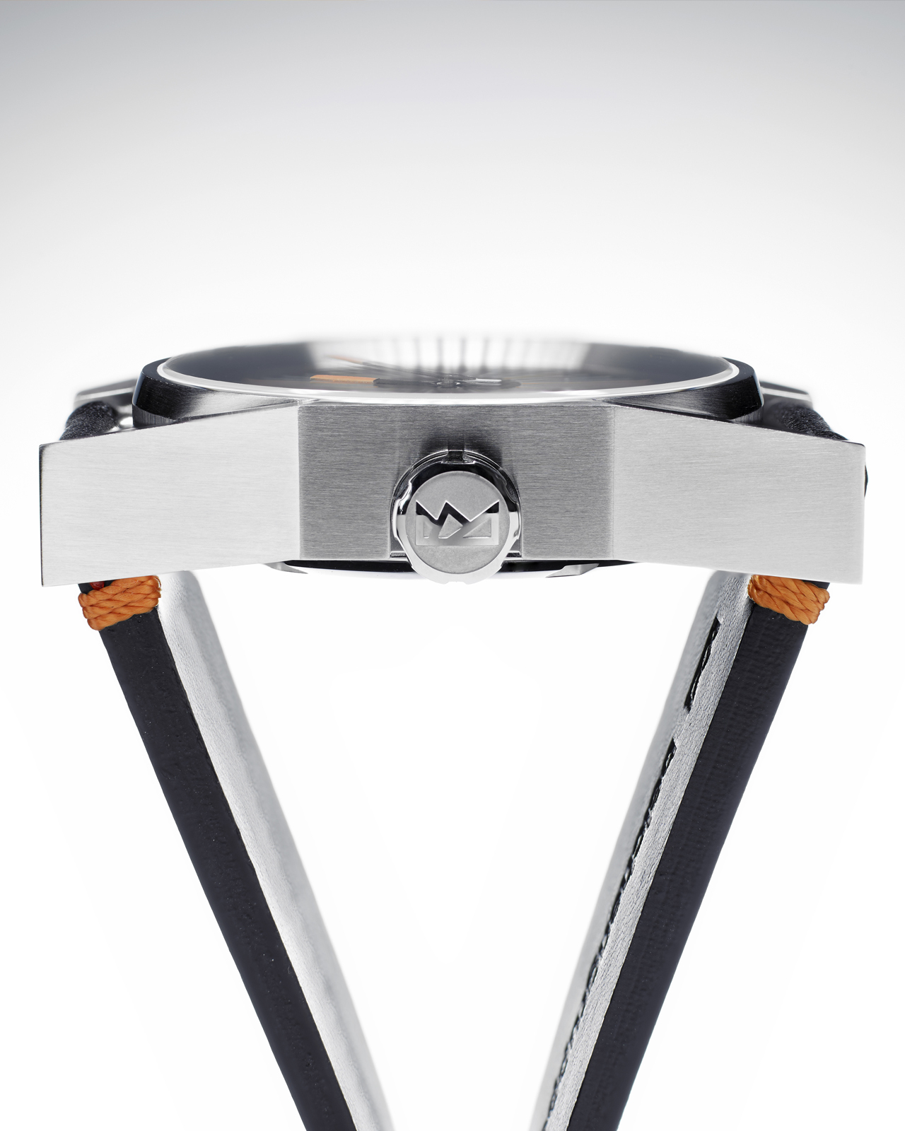
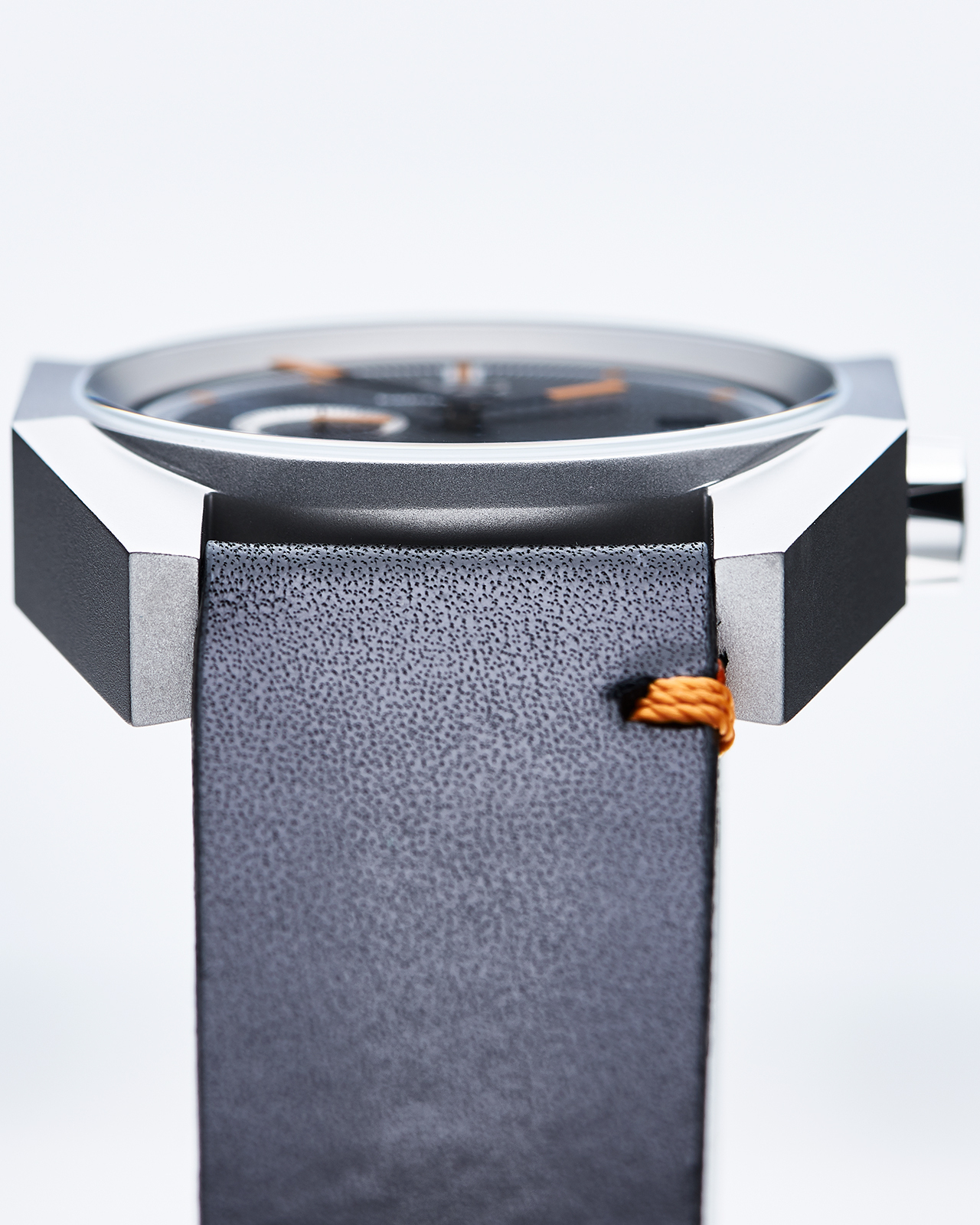
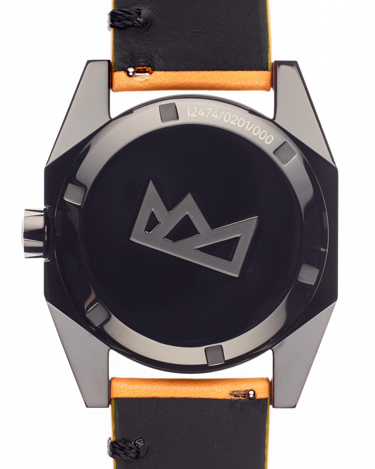
The 1247 case is named after the hight of the Alsatian Belchen (Ballon d'Alsace). Its faceted surfaces and crisp edges give it a highly distinctive character, while its play with familiar archetypes makes it feel surprisingly familiar. The form appears cut from a solid block, with curves reduced to a minimum. At first glance, the watches almost appear brutal.
Like a crystal, angles and surfaces shape the case. The striking 22° angle of the lugs corresponds exactly to the angle at which light is refracted through an ice crystal, embodying the rays of the sun and the DNA of the brand. The flat sapphire crystal, protruding just 0.1 mm, and the closed case back reinforce the solid, crystalline design. The edges are imperceptible on the wrist. Run your fingers across the case and the sensation shifts from smooth, tactile surfaces to fascinating angularity and back again.
The 1247 is available in four finishes: brushed, pearl-blasted, polished, or brushed and coated with black DLC (Diamond-Like Carbon). The brushed finish accentuates the case’s crisp edges with shimmering reflections. Pearl-blasting gives the case a technical appearance while keeping it soft to the touch. Mirror-polished, it becomes a diamond in steel. The deep-black DLC finish accentuates the case’s striking surfaces and reinforces its architectural character. For comfort and easy cleaning, however, the case back is always polished.
THE CROWN
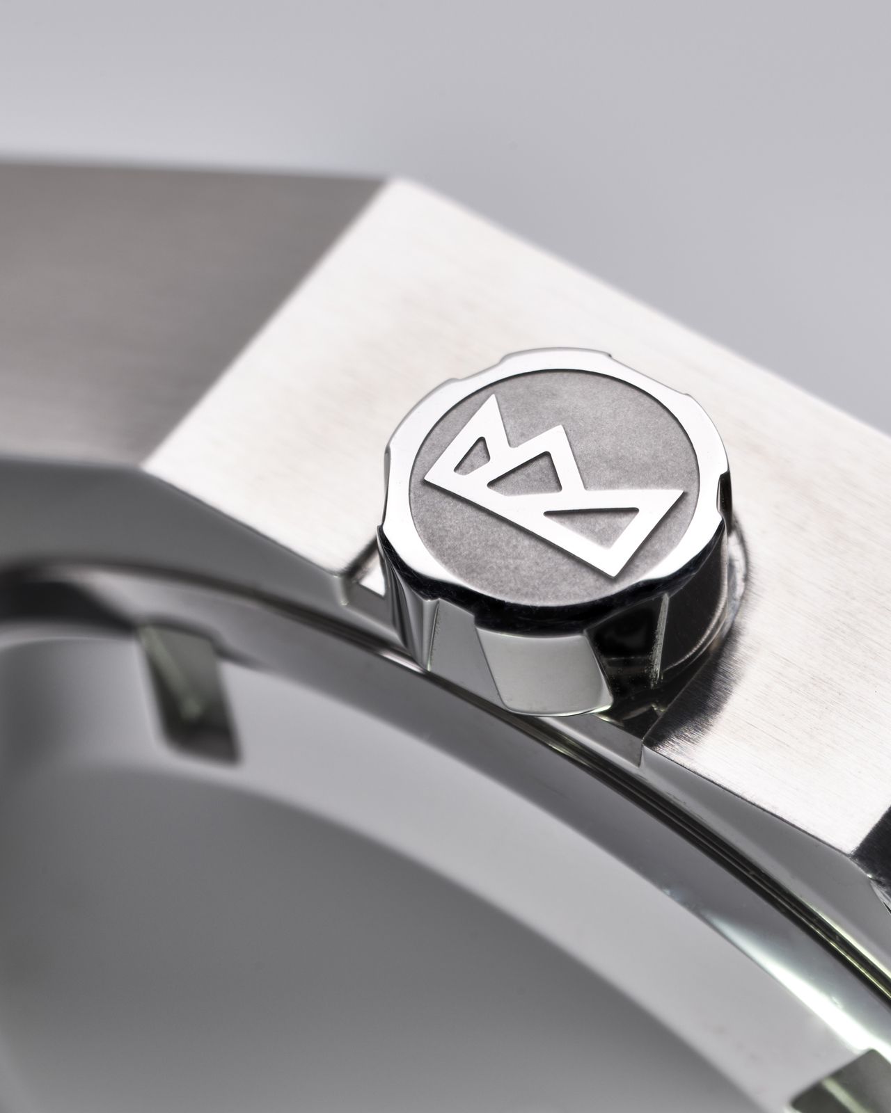
Our crown is more than just the knurled wheel used to wind and set the movement. To us, it is a polished gem: within a surface measuring just 3 × 6 mm, every aspect of our design comes together.
Its knurling is both functional and surprising. The recesses echo the 22° angle of the case, creating distinctive grip surfaces on two levels. At the outer edge, they interrupt the perfect circle, making the crown appear less round and more polygonal. The polished logo seems to float above the matt surface.
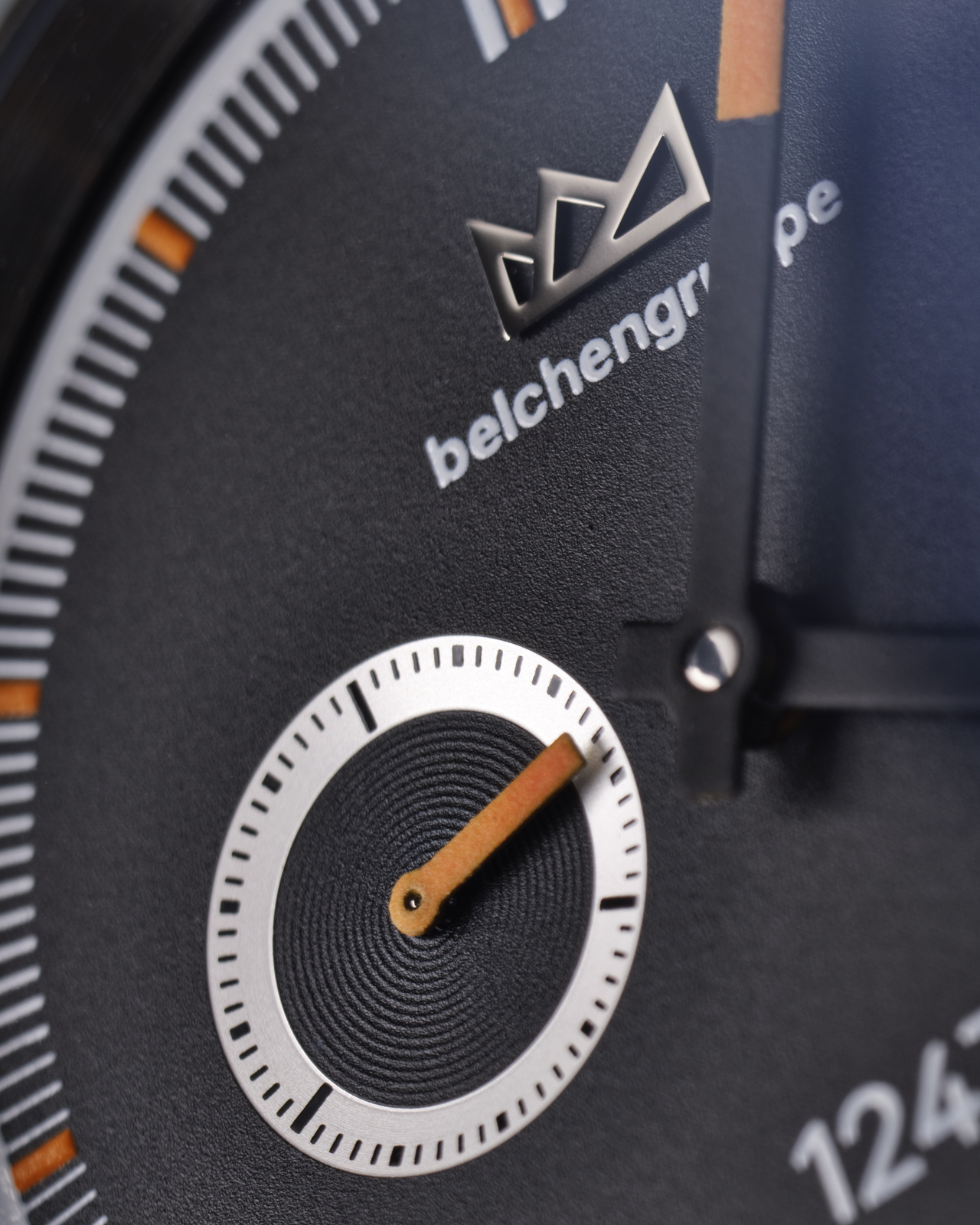


The three dials challenge conventional ways of seeing and play with the subjectivity of our perception of time. They are precise yet playful reinterpretations of what telling time means.
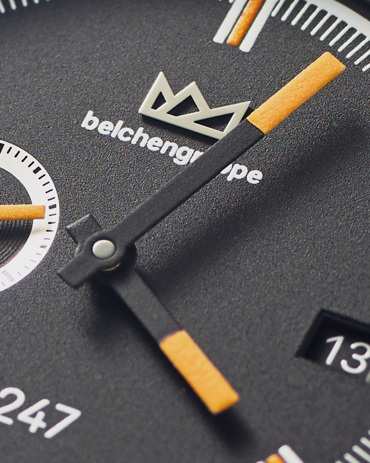
The Belchengruppe logo is applied as a polished element, while the recessed small seconds adds a third level to the dial. Orange is our colour of sunrise over the Belchen mountains – which is why all orange details are executed in Super-LumiNova.
“120°” recalls a classic measuring instrument with its detailed minute track, but divides the hour into three rather than four sections. The dial therefore emphasises a span of 20 minutes rather than the quarter hour – which always seems to fly by too quickly.
The “Visuren” dial recalls the rays of the sun and the lines of sight between the Belchen mountains. The indices are not in their conventional positions, but are effectively rotated by 30 minutes, emphasising the half hour. This visual disruption changes the way time is read: rather than the precision of the dial, intuition based on the position of the hands becomes the focus.
“Visuren #22” visualises the perceived elasticity of time. It reinterprets the classic sunburst finish, transforming the sun’s rays into an optical illusion. The increasing density of the rays towards the small seconds appears to accelerate the passage of time, while their even distribution across the hours restores the continuity of time.
THE HANDS
It is not the movement, the case or even the dial that makes a timepiece recognisable as a watch. It is the hands. Without them, a watch is not a watch. With them, almost anything can become a visual representation of time.
The hands of Belchengruppe are clear and angular. They are deliberately not designed for reading the time down to the second, but instead make their angular position highly visible. Their black surface allows them to disappear halfway into the dial, leaving only the orange luminous material to indicate the time.
For the experienced time reader, this makes them perfectly suited to taking a precise look at imprecise time.
SMALL SECONDS AT NINE
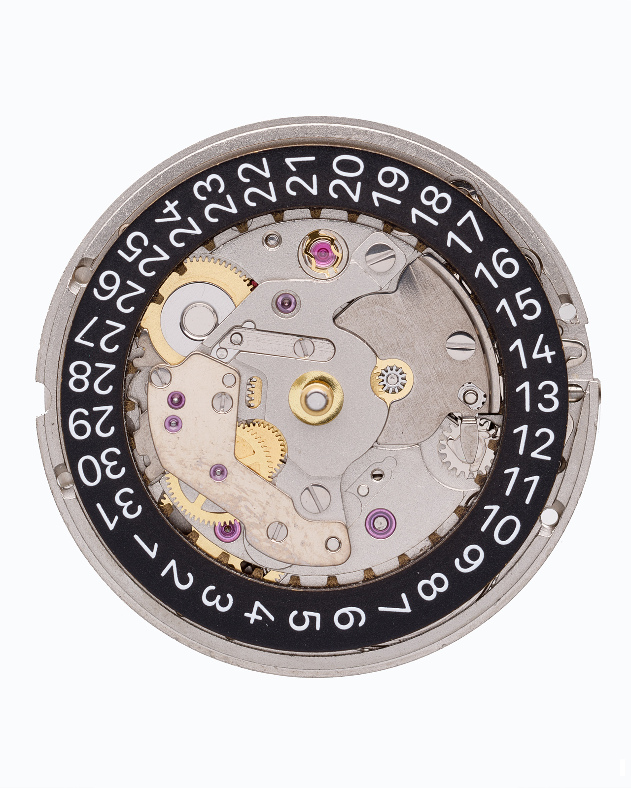
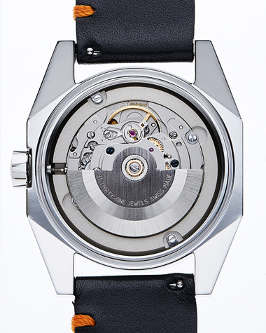
Our watches are powered by the automatic Sellita SW290-1 calibre, with date and small seconds at nine o’clock. We chose this complication primarily for design reasons: the small seconds create additional creative opportunities for the dials design, while positioning them at nine o’clock, together with the date window, ensures a balanced symmetry of the display.
The seconds display also serves as a functional indicator and features stop-second, allowing the watch to be set precisely.
The date ring is printed in our exclusive house typeface, Belchen Grotesk. It has been optimised for displaying small numerals, making the date exceptionally easy to read.
With 31 jewels, Incabloc shock protection and a frequency of 28,800 A/h (4 Hz), the movement offers a power reserve of at least 38 hours.
Sellita is based in La Chaux-de-Fonds and is one of the largest and best-known manufacturers of Swiss watch movements. Sellita’s 200 series is known for its robustness and accuracy. And should anything ever need repairing, replacement parts are freely available. Any watchmaker can order them and get your favourite watch running again.
THE LEATHER STRAPS
Our straps are also essential to the overall appearance of our watches. Their angular, almost seamless design is unusual for leather straps and echoes the striking geometry of the case. At the same time, they add a playful detail of their own: the distinctive single-sided bar stitching specific to Belchengruppe.

The cowhide has an extra-fine grain. It does not dominate visually, but remains pronounced enough for the material to be recognisable as leather. This natural material deliberately contrasts with the technical character of the steel case, bringing together vitality and technology.

The shape of the solid pin buckle echoes the side profile of the case and, despite its angular form, sits comfortably on the wrist.
And thanks to the quick-release spring bars, changing the strap is effortless – no tools are required and there is no risk of scratching the case.

THE BELCHEN GROTESK
Our house typeface, Belchen Grotesk, embodies the values of Belchengruppe with its clean, unadorned letterforms: precision, elegance and a playful take on archetypes.
To ensure excellent legibility even at small sizes, we paid particular attention to the design of the numerals, including the open-top 4.
It is a Swiss-style neo-grotesk that contrasts the technical character of an automatic watch with organic forms: narrow circular shapes in “C”, “O” and “Q”, perfectly round dots, and details such as the curved leg of the “R” or the notched tip of the “t”.
